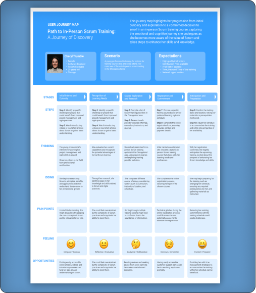
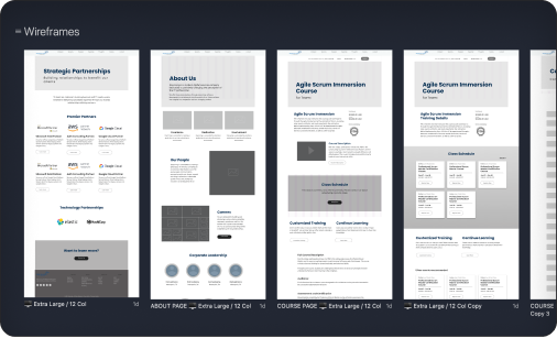
Design Phase
Introducing a bit of “Flair”
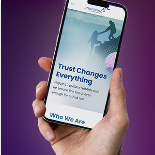
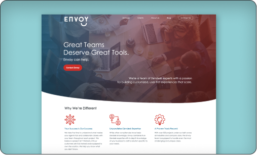
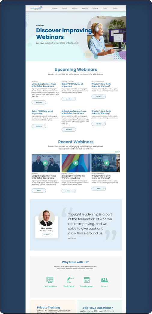
Imaginative illustrations and vibrant photographs were integrated to create an immersive experience that fostered an atmosphere of curiosity and discovery. These visuals brought the content to life, sparking a sense of fun and learning into the website.
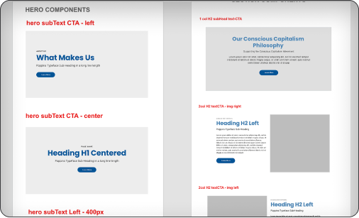
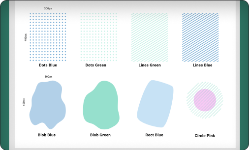
One special feature, given the moniker “Flair,” was implemented to add a custom feel to elements on the site. This feature allows for flexibility by placing Flair on any corner of the image using the Content Management System.
The team chose eight elements, providing various options to enhance and customize the visual experience. The number was limited to maintain consistency and familiarity across various components in the CMS.
Examples of the illustration elements named “Flair” that could be used.
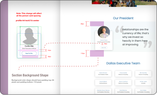
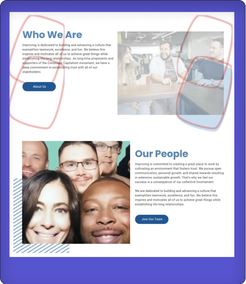
The illustration shows the possible placement of the “Flair” if the user chose the element labeled “Rect Blue” in the CMS. This feature allows for flexibility in marketing by allowing the placement of “Flair” on any corner of the component.
The second example in the illustration displays the “Lines Blue” element placed in the bottom-left position of the component.
Examples “Flair” in place and the red markings above show the possible placement using the CMS.